Most designers have opinions about design systems. Fewer have actually built one from the token layer up. This is my ongoing attempt to do it properly: not just a component library, but a full pipeline from Figma to code, documented well enough that someone else could pick it up and contribute.
It exists because I wanted to practice the workflows I advocate for in client work. That means making real decisions about token architecture, managing the gap between design tools and production code, and figuring out how to document a system in a way that actually gets used.
The Token Architecture
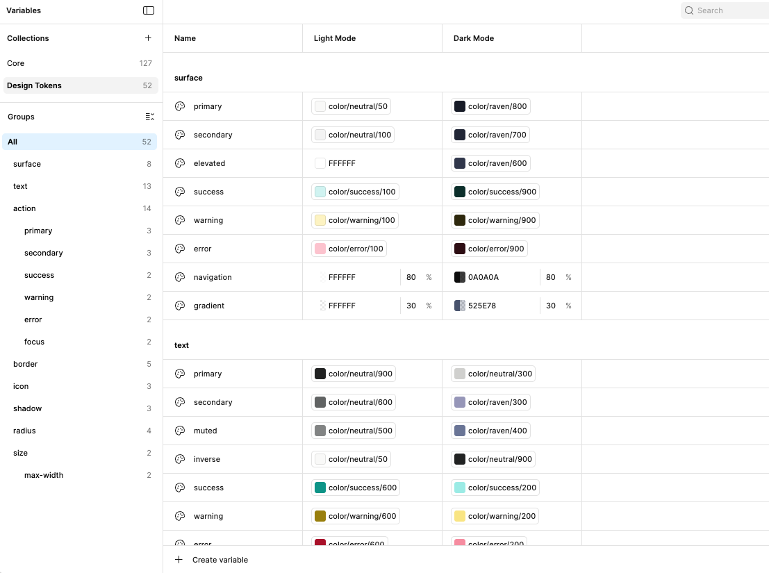
The foundation is a three-layer token structure: core, semantic, and component. Core tokens define raw values, the full color palette, base spacing scale, type sizes. Semantic tokens assign meaning to those values. color-background-primary points to a core color, not a hex code. Component tokens scope decisions to a specific context, so a button's hover state pulls from semantic tokens rather than reaching back to core.
This layering is what makes a design system maintainable. When a brand color changes, you update one core token and the change propagates correctly through every semantic and component token that references it. Without this structure, you're making the same change in forty places and hoping you caught them all.
From Figma to Code
Tokens are exported from Figma as Design Tokens Format Module (DTFM) JSON files and run through a custom script in the codebase that converts them to CSS custom properties. The output is a structured variables file that the component library consumes directly.
The script sits between the export and the codebase rather than using Style Dictionary, which was a deliberate choice for now. The overhead of Style Dictionary is worth it at scale, but for a system this size a lightweight custom script keeps the pipeline simple and easy to debug. Style Dictionary is on the roadmap.
Components in Storybook
Components are built in isolation in Storybookopen_in_new, deployed to a subdomain of this site. Building in isolation enforces a discipline that's easy to skip in a real product codebase: components have to work without assuming any surrounding context, which surfaces edge cases and accessibility issues earlier than they would otherwise.
Embedded preview. If it doesn’t load, use the link above to open Storybook in a new tab.
Documentation in ZeroHeight
The system is documented in ZeroHeightopen_in_new, pulling in Figma frames and Storybook components directly. WCAG compliance documentation and usage patterns live here alongside the components themselves, not as a separate audit, but as part of the component documentation.
Keeping accessibility documentation in ZeroHeight rather than a separate doc means it stays current with the components. When a component changes, the documentation is right there to update.
This system is incomplete and that is the point. The pipeline is real, the architecture is sound, and the decisions are documented. Style Dictionary is next. After that, motion tokens.